4. Working with NetDraw to visualize graphs
Introduction: A picture is worth...
As we saw in chapter 3, a graph representing the information about the relations among nodes can be an very efficient way of describing a social structure. A good drawing of a graph can immediately suggest some of the most important features of overall network structure. Are all the nodes connected? Are there many or few ties among the actors? Are there sub-groups or local "clusters" of actors that are tied to one another, but not to other groups? Are there some actors with many ties, and some with few?
A good drawing can also help us to better understand how a particular "ego" (node) is "embedded" (connected to) its "neighborhood" (the actors that are connected to ego, and their connections to one another) and to the larger graph (is "ego" an "isolate" a "pendant"?). By looking at "ego" and the "ego network" (i.e. "neighborhood"), we can get a sense of the structural constraints and opportunities that an actor faces; we may be better able to understand the role that an actor plays in a social structure.
There is no single "right way" to represent network data with graphs. There are a few basic rules, and we reviewed these in the previous chapter. Different ways of drawing pictures of network data can emphasize (or obscure) different features of the social structure. It's usually a good idea to play with visualizing a network, to experiment and be creative. There are a number of software tools that are available for drawing graphs, and each has certain strengths and limitations. In this chapter, we will look at some commonly used techniques for visualizing graphs using NetDraw (version 4.14, which is distributed along with UCINET). There are many other packages though, and you might want to explore some of the tools available in Pajek, and Mage (look for software at the web-site of the International Network of Social Network Analysts - INSNA).
Of course, if there are a large number of actors or a large number of relations among them, pictures may not help the situation much; numerical indexes describing the graph may be the only choice. Numerical approaches and graphical approaches can be used in combination, though. For example, we might first calculate the "between-ness centrality" of the nodes in a large network, and then use graphs that include only those actors that have been identified as "important."
Differences of kind: We often have information available about some attributes of each the actors in our network. In the Bob, Carol, Ted and Alice example, we noted that two of the actors were male and two female. The scores of the cases (Bob, Carol, Ted, Alice) on the variable "sex" are a nominal dichotomy. It is also pretty common to be able to divide actors in a "multiple-choice" way; that is, we can record an attribute as a nominal polyotomy (for example, if we knew the religious affiliation of each actor, we might record it as "Christian," "Muslim," "Jewish," "Zoroastrian," or whatever).
It is often the case that the structure of a network depends on the attributes of the actors embedded in it. If we are looking at the network of "spouse" ties among Bob, Carol, Ted, and Alice, one would note that ties exist for male-female pairs, but not (in our example) for female-female or male-male pairs. Being able to visualize the locations of different types of actors in a graph can help us see patterns, and to understand the nature of the social processes that generated the tie structure.
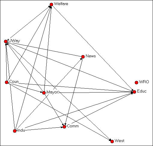
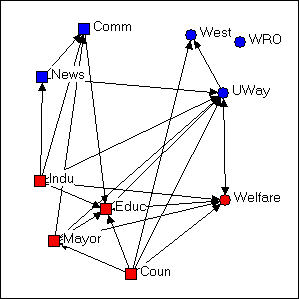
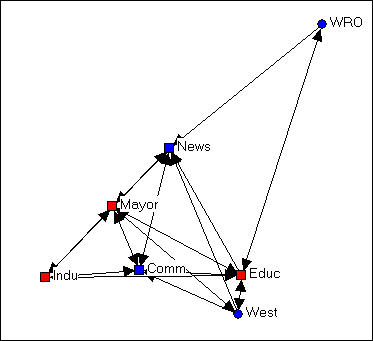
Using colors and shapes are useful ways of conveying information about what "type" of actor each node is. Figures 4.1 and 4.2 provide an example. The data here describe the exchange of information among ten organizations that were involved in the local political economy of social welfare services in a Midwestern city (from a study by David Knoke; the data are one of the data sets distributed with UCINET). In Figure 4.1, NetDraw has been used to render a directed graph of the data. This is done by opening Netdraw>File>Open>UCInet dataset>Network, and locating the data file. NetDraw produces a basic graph that you can then edit.
Figure 4.1. Knoke information exchange network
Institutional theory might suggest that information exchange among organizations of the same "type" would be more common than information exchange between organizations of different types. Some of the organizations here are governmental (Welfare, Coun, Educ, Mayor, Indu), some are non-governmental (UWay, News, WRO, Comm, West).
In Netdraw, we used the Transform>mode attribute editor to assign a score of "1" to each node if it was governmental, and "0" if it was not. We then used Properties>nodes>color>attribute-based to select the government attribute, and assign the color red to government organizations, and blue to non-government organizations. You could also create an attribute data file in UCINET using the same nodes as the network data file, and creating one or more columns of attributes. NetDraw>File>Open>UCInet dataset>Attribute data can then be used to open the attributes, along with the network, in NetDraw.
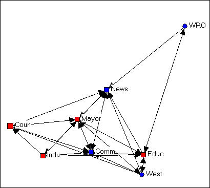
Ecological theory of organizations suggests that a division between organizations that are "generalists" (i.e. perform a variety of functions and operate in several different fields) and organizations that are "specialists" (e.g. work only in social welfare) might affect information-sharing patterns.
In Netdraw, we used the Transform>mode attribute editor to create a new column to hold information about whether each organization was a "generalist" or a "specialist." We assigned the score of "1" to "generalists" (e.g. the Newspaper, Mayor) and a score of "0" to "specialists (e.g. the Welfare Rights Organization). We then used Properties>nodes>shape>attribute-based to assign the shape "square" to generalists and "circle" to specialists. The result of these operations is shown in figure 4.2.
Figure 4.2. Knoke information exchange with government/non-government and specialist/generalist codes
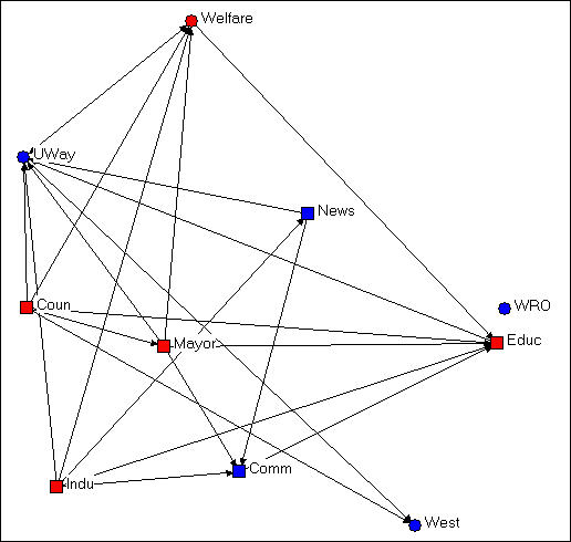
A visual inspection of the diagram with the two attributes highlighted by node color and shape is much more informative about the hypotheses of differential rates of connection among red/blue and among circle/square. It doesn't look like this diagram is very supportive of either of our hypotheses.
Identifying types of nodes according to their attributes can be useful to point out characteristics of actors that are based on their position in the graph. Consider the example in the next figure, 4.3.
Figure 4.3 Knoke information exchange with k-cores
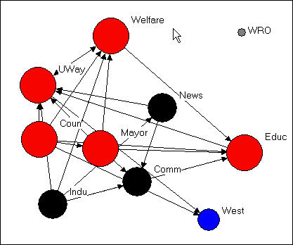
This figure was created by using the Analysis>K-core tool that is built into NetDraw. We'll talk about the precise definition of a k-core in a later chapter. But, generally, a k-core is a set of nodes that are more closely connected to one another than they are to nodes in other k-cores. That is, a k-core is one definition of a "group" or "sub-structure" in a graph.
Figure 4.3 shows four sub-groups, which are colored to identify which nodes are members of which group (the "West" group and the "WRO" group each contain only a single node). In addition, the size of the nodes in each K-core are proportional to the size of the K-core. The largest group contains government members (Mayor, County Government, Board of Education), as well as the main public (Welfare) and private (United Way) welfare agencies. A second group, colored in black, groups together the newspaper, chamber of commerce, and industrial development agency. Substantively, this actually makes some sense!
This example shows that color and shape of nodes to represent qualitative differences among actors can be based on classifying actors according to their position in the graph, how they are embedded, rather than on some inherent feature of the actor itself (e.g. governmental or non-governmental). One can use UCINET (or other programs) to identify "types" of actors based on their relations (e.g. where are the cliques?), and then enter this information into the attribute editor of NetDraw (Transform>node attribute editor>edit>add column). The groupings that are created by using Analysis tools already built-in to NetDraw are automatically added to the node attribute data base).
Differences of amount: Figure 4.3 also uses the size of the nodes (Properties>nodes>size>attribute-based) to display an index of the number of nodes in each group. This difference of amount among the nodes is best indicated, visually, by assigning the size of the node to values of some attribute. In example 4.3, NetDraw has done this automatically for an amount that was computed by its Analysis>K-cores tool. One can easily compute other variables reflecting differences in amount among actors (e.g. how many "out degrees" or arrows from each actor are there?) using UCINET or other programs. Once these quantities are computed, they can be added to NetDraw (Transform>node attribute editor>edit>add column), and then added to the graph (Properties>nodes>size>attribute-based).
Differences of amount among the nodes could also reflect an attribute that is inherent to an actor alone. In the welfare organizations example, we might know the annual budget or number of employees of each organization. These measures of organizational "size" might be added to the node attributes, and used to scale the size of the nodes so that we could see whether information sharing patterns differ by organizational size.
Color, shape, and size of the nodes in a graph then can be used to visualize information that we have about the attributes of the actors. These attributes can be based on either "external" information about inherent differences in kind and amount among the actors; or, the attributes can be based on "internal" information about differences in kind and amount that describe how the actor is embedded in the relational network.
A graph, as we discussed in the last chapter, is made up of both the actors and the relations among the actors. The relations among the actors (the line segments in a simple graph or the arrows in a directed graph) can also have "attributes." Sometimes it can be very helpful to use color and size to indicate difference of kind and amount among the relations. You can be creative with this idea to explore and display patterns in the connections among the actors in a network. Here are a few ideas of things that you could do.
Suppose that you wanted to highlight certain "types" of relations in the graph. For example, in a sociogram of friendship ties you might want to show how the patterns of ties among persons of the same sex differed from the patterns of ties among persons of different sexes. You might want to show the ties in the graph as differing in color or shape (e.g. dashed or solid line) depending on the type of relation. If you have recorded the two kinds of relations (same sex, different sex) as two relations in a multiplex graph, then you can use NetDraw's Properties>Lines>Color from the menu. Then select Relations, and choose the color for each of the relations you want to graph (e.g. red for same-sex, blue for different-sex).
Line colors (but not line shapes) can be used to highlight links within actors of the same type or between actors of different types, or both, using NetDraw. First select Properties>Lines>Node-attribute from the menus. Then select whether you want to color the ties among actors of the same attribute type ("within") or ties among actors of different types ("between"), or both. Then use the drop-down menu to select the attribute that you want to graph.
If you have measured each tie with an ordinal or interval level variable (usually reflecting the "strength" of the tie), you can also assign colors to ties based on tie strength (Properties>Lines>Color>Tie-strength). But, when you have information on the "value" of the relations, a different method would usually be preferred.
Where the ties among actors have been measured as a value (rather than just present-absent), the magnitude of the tie can be suggested by using thicker lines to represent stronger ties, and thinner lines to represent weaker ties. Recall that sometimes ties are measured as negative-neutral-positive (recorded as -1, 0, +1), as grouped ordinal (5=very strong, 4=strong, 3= moderate, 2=weak, 1=very weak, 0=absent), full-rank order (10=strongest tie of 10, 9=second strongest tie of 10, etc.), or interval (e.g. dollars of trade flowing from Belgium to the United States in 1975).
Since the value of the tie is already recorded in the data set, it is very easy to get NetDraw to visualize it in the graph. From the menus, select Properties>Lines>Size. Then, select Tie-Strength and indicate which relation you want graphed. You can select the amount of gradation in the line widths (e.g. from 0 to 5 for a grouped ordinal variable with 6 levels; or from 5 to 10 if you want really thick lines).
Using line colors and thickness, you can highlight certain types of ties and varying strength of ties among actors in the network. This can be combined with visual highlighting of attributes of the actors to make a compelling presentation of the features of the graph that you want to emphasize. There is a lot of art to this, and you will have to play and experiment. Node and line attributes can obscure as well as reveal; they can mis-represent, as well as represent. Sometimes, they add to the confusion of an already too-complicated graph.
table of contents of this page
Most graphs of networks are drawn in a two-dimensional "X-Y axis" space (Mage and some other packages allow 3-dimensional rendering and rotation). Where a node or a relation is drawn in the space is essentially arbitrary -- the full information about the network is contained in its list of nodes and relations. The figures below are exactly the same network (Knoke's money flow network) that has been rendered in several different ways.
Figure 4.4 Random configuration of Knoke's money network
This drawing was created using NetDraw's Layout>Random on the graph that we had previously "colored" (blue for non-government, red for government; circles for welfare specialists, squares for generalists). This algorithm locates the nodes randomly in the X-Y space (you can use other tools to change the size of the graphic, rotate it, etc.). Since the X and Y directions don't "mean" anything, the location of the nodes and relations don't provide any particular insight.
Figure 4.5 Free-hand grouping by attributes configuration of Knoke's money network
In figure 4.5, we've used the "drag and drop" method ("grab" a node with the cursor, and drag it to a new location) to relocate the nodes so that organizations that share the same combinations of attributes are located in different quadrants of the graph. Since we had hypothesized that organizations of like "kind" would have higher rates of connection, this is a useful (but still arbitrary) way to locate the points. If the hypothesis were strongly supported (and its not) most of the arrows would be located within each the four quadrants, and there would be few arrows between quadrants. NetDraw has a built-in tool that allows the user to assign the X and Y dimensions of the graph to scores on attributes (either categorical or continuous): Layout>Attributes as Coordinates, and then select attributes to be assigned to X or Y or both. This can be a very useful tool for exploring how patterns of ties differ within and between "partitions" (or types of nodes).
Figure 4.6 Circle configuration of Knoke's money network
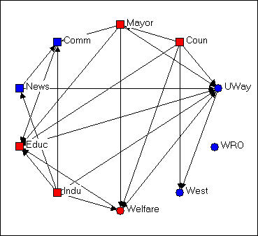
Figure 4.6 shows the same graph using Layout>Circle, and selecting the "generalist-specialist" (i.e. the circle or square node type) as the organizing criterion. Circle graphs are commonly used to visualize which nodes are most highly connected. The nodes are located at equal distances around a circle, and nodes that are highly connected are very easy to quickly locate (e.g. UWay, Educ) because of the density of lines. When nodes sharing the same attribute are located together in a segment of the circle, the density of ties within and between types is also quite apparent.
In each of the different layouts we've discussed so far, the distances between the nodes are arbitrary, and can't be interpreted in any meaningful way as "closeness" of the actors. And, the "directions" X and Y have no meaning -- we could rotate any of the graphs any amount, and it would not change a thing about our interpretation. There are several other commonly used graphic layouts that do try to make the distances and/or directions of locations among the actors somewhat more meaningful.
Figure 4.7 Non-metric multi-dimensional scaling configuration of Knoke's money network
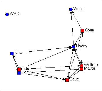
Figure 4.7 was generated using the Layout>Graph Theoretic Layout>MDS tool of NetDraw. MDS stands for (non-metric, in this case) "Multi-Dimensional Scaling." MDS is a family of techniques that is used (in network analysis) to assign locations to nodes in multi-dimensional space (in the case of the drawing, a 2-dimensional space) such that nodes that are "more similar" are closer together. There are many reasonable definitions of what it means for two nodes to be "similar." In this example, two nodes are "similar" to the extent that they have similar shortest paths (geodesic distances) to all other nodes. There are many, many ways of doing MDS, but the default tools chosen in NetDraw can often generate meaningful renderings of graphs that provide insights. NetDraw has several built-in algorithms for generating coordinates based on similarity (metric and non-metric two-dimensional scaling, and principle components analysis).
One very important difference between figure 4.7 and the earlier graphs is that the distances between the nodes is interpretable. The "Welfare" and "Mayor" nodes are very similar in their geodesic distances from other actors. "West" and "Educ" have very different patterns of ties to the other nodes.
The other important difference between figure 4.7 and the earlier graphs is that direction may be meaningful. Notice that there is a cluster of nodes at the left (News, Indu, Comm) that are all pretty much not welfare organizations themselves, while the nodes at the right are (generally) more directly involved in welfare service provision. The upper left-hand quadrant contains mostly "blue" nodes, while the lower right quadrant contains mostly "red" ones -- so one "direction" might be interpreted as "non-government/government."
Let me emphasize that different applications of MDS (and other scaling tools) to different definitions of what it means for nodes to be "similar" can generate wildly different looking graphs. These are (almost always) exploratory techniques, and there is (usually) no single "correct" interpretation. But, a graphic that uses both distance and direction to summarize something about the structure of the network can provide considerable insight when compared to graphs (like figures 4.4, 4.5, and 4.6) that don't.
Consider one last example of rendering the same data, this time using NetDraw's unique built-in algorithm for locating points (Layout>Graph Theoretic Layout>Spring Embedding).
Figure 4.8 "Spring-embedding" configuration of Knoke's money network
You might immediately notice that this graph is fairly similar to the MDS solution. The algorithm uses iterative fitting (i.e. start with a random graph, measure "badness" of fit; move something, measure "badness" and if it's better keep going in that direction...) to locate the points in such a way as to put those with smallest path lengths to one another closest in the graph. This approach can often locate points very close together, and make for a graph that is hard to read. In the current example, we've also selected the optional "node repulsion" criterion that creates separation between objects that would otherwise be located very close to one another. We've also used the optional criterion of seeking to make the paths of "equal edge length" so that the distances between adjacent objects are similar.
The result is a graph that preserves many of the features of the dimensional scaling approach (distances are still somewhat interpretable; directions are often interpretable), but is usually easier to read -- particularly if it matters which specific nodes are where (rather than node types of clusters).
There is no one "right way" to use space in a graph. But one can usually do much better than a random configuration -- particularly if one has some prior hypotheses or research questions about the kinds of patterns that would be meaningful.
table of contents of this page
Large networks (those that contain many actors, many kinds of relations, and/or high densities of ties) can be very difficult to visualize in any useful way -- there is simply too much information. Often, we need to clear away some of the "clutter" to see main patterns more clearly.
One of the most interesting features of social networks -- whether small or large -- is the extent to which we can locate "local sub-structures." We will discuss this topic a good bit more in a later chapter. Highlighting or focusing attention on sub-sets of nodes in a drawing can be a powerful tool for visualizing sub-structures.
In this section, we will briefly outline some approaches to rendering network drawings that can help to simplify complex diagrams and locate interesting sub-graphs (i.e. collections of nodes and their connections).
Clearing away the underbrush
Social structures can be composed of multiple relations. Bob, Carol, Ted, and Alice in our earlier example are a multi-plex structure of people connected by both friendship and by spousal ties. Graphs that display all of the connections among a set of nodes can be very useful for understanding how actors are tied together -- but they can also get so complicated and dense that it is difficult to see any patterns. There are a couple approaches that can help.
One approach is to combine multiple relations into an index. For example, one could combine the information on friendship and spousal ties using an "and" rule: if two nodes have both a friendship and spousal tie, then they have a tie - otherwise they do not (i.e. if they have no tie, or only one type of tie). Alternatively, we could create an index that records a tie when there is either a friendship tie or a spousal tie. If we had measured relations with values, rather than simple presence-absence, multiple relations could be combined by addition, subtraction, multiplication, division, averaging, or other methods. UCINET has tools for these kinds of operations, that are located at: Transform>matrix operations>within dataset>aggregations.
The other approach is to simplify the data a bit. NetDraw has some tools that can be of some help.
Rather than examining the information on multiple kinds of ties in one diagram, one can look at them one at a time, or in combination. If the data have been stored as a UCINET or NetDraw data file with multiple relations, then the Options>View>Relations Box opens a dialog box that lets you select which relations you want to display. Suppose that we had a data set in which we had recorded the friendship ties among a number of people at intervals over a period of time. By first displaying the first time point, and then adding subsequent time point, we can visualize the evolution of the friendship structure.
It isn't unusual for some of the nodes in a graph of a social network to not be connected to the others at all. Nodes that aren't connected are called "isolates." Some nodes may be connected to the network by a single tie. These nodes sort of "dangle" from the diagram; they are called "pendants." One way of simplifying graphs is to hide isolates and/or pendants to reduce visual clutter. Of course, this does mis-represent the structure, but it may allow us to focus more attention where most of the action is. NetDraw has both button-bar tools and a menu item (Analysis>Isolates) to hide these less-connected nodes.
Finding and visualizing local sub-structures
One of the common questions in network analysis is whether a graph displays various kinds of "sub-structures." For example, a "clique" is a sub-structure that is defined as a set of nodes where every element of the set is connected to every other member. A network that has no cliques might be a very different place than a network that has many small cliques, or one that has one clique and many nodes that are not part of the clique. We'll take a closer look at UCINET tools for identifying sub-structures in a later chapter.
NetDraw has built-in a number of tools for identifying sub-structures, and automatically coloring the graph to identify them visually.
Analysis>components locates the parts of graph that are completely disconnected from one another, and colors each set of nodes (i.e. each component). In our Bob-Carol-Ted-Alice example, the entire graph is one component, because all the actors are connected. In the welfare bureaucracies example, there are two components, one composed of only WRO (which does not receive ties from any other organization) and the other composed of the other nine nodes. In NetDraw, executing this command also creates a variable in the database of node attributes -- as do all the other commands discussed here. These attributes can then be used for selecting cases, changing color, shape, and size, etc.
Analysis>Blocks and Cutpoints locates parts of the graph that would become disconnected components if either one node or one relation were removed (the blocks are the resulting components; the cutpoint is the node that would, if removed, create the dis-connect). NetDraw graphs these sub-structures, and saves the information in the node-attribute database.
Analysis>K-cores locates parts of the graph that form sub-groups such that each member of a sub-group is connected to N-K of the other members. That is, groups are the largest structures in which all members are connected to all but some number (K) of other members. A "clique" is a group like this where all members are connected to all other members; "fuzzier" or "looser" groups are created by increasing "K." NetDraw identifies the K-cores that are created by different levels of K, and provides colored graphs and data-base entries.
Analysis>Subgroups>block based. Sorry, but I don't know what this algorithm does! Most likely, it creates sub-structures that would become components with differing amounts of nodes/relations removed.
Analysis>Subgroups>Hierarchical Clustering of Geodesic Distances. The geodesic distance between two nodes is the length of the shortest path between them. A hierarchical clustering of distances produces a tree-like diagram in which the two nodes that are most similar in their profile of distances to all other points are joined into a cluster; the process is then repeated over and over until all nodes are joined. The resulting graphic is one way of understanding which nodes are most similar to one another, and how the nodes may be classified into "types" based on their patterns of connection to other nodes. The graph is colored to represent the clusters, and database information is stored about the cluster memberships at various levels of aggregation. A hierarchical clustering can be very interesting in understanding which groups are more homogeneous (those that group together at early stages in the clustering) than others; moving up the clustering tree diagram, we can see a sort of a "contour map" of the similarity of nodes.
Analysis>Subgroups>Factions (select number). A "faction" is a part of a graph in which the nodes are more tightly connected to one another than they are to members of other "factions." This is quite an intuitively appealing idea of local clustering or sub-structure (though, as you can see, only one such idea). NetDraw asks you how many factions you would like to find (always explore various reasonable possibilities!). The algorithm then forms the number of groups that you desire by seeking to maximize connection within, and minimize connection between the groups. Points are colored, and the information about which nodes fall in which partitions (i.e. which cases are in which factions) is saved to the node attributes database.
Analysis>Subgroups>Newman-Girvan. This is another numerical algorithm that seeks to create clusters of nodes that are closely connected within, and less connected between clusters. The approach is that of "block modeling." Rows and columns are moved to try to create "blocks" where all connections within a block are present, and all connections between blocks are absent. This algorithm will usually produce results similar to the factions algorithm. Importantly, though, the Newman-Girvan algorithm also produces measures of goodness-of-fit of the configuration for two blocks, three blocks, etc. This allows you to get some sense of what division into blocks is optimal for your needs (there isn't one "right" answer).
Ego Networks (neighborhoods)
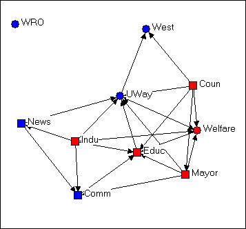
A very useful way of understanding complicated network graphs is to see how they arise from the local connections of individual actors. The network formed by selecting a node, including all actors that are connected to that node, and all the connections among those other actors is called the "ego network" or (1-step) neighborhood of an actor. Figure 4.9 is an example from the Knoke bureaucracies information network, where we select as our "ego" the board of education.
Figure 4.9. Ego network of Educ in Knoke information network
We note that the ego-network of the board of education is fairly extensive, and that the density of connection among the actors in the ego-network is fairly high. This is to say say the the board of education is quite "embedded" in a dense local sub-structure.
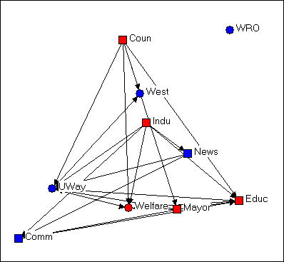
Next, let's add the ego network of the "West" agency, in figure 4.10.
Figure 4.10. Ego networks of Educ and West in Knoke information network
The two ego networks combined result in a fully connected structure. We note that one connection between Educ and Coun is mediated by West.
One can often gain considerable insight about complicated networks by "building" them starting with one actor and adding others. Or, one can begin with the whole network, and see what happens as individual's ego networks are removed.
The network of each individual actor may also be of considerable interest. Who's most connected? How dense are the neighborhoods of particular actors?
NetDraw has useful tools for visualizing and working with ego-networks. The Layout>Egonet command presents a dialog box that lets you select which ego's networks are to be displayed. You can start with all the actors and delete; or start with focal actors and build up the full network.
table of contents of this page
Input
There are several ways to get data into NetDraw. Probably the simplest is to import data from UCINET or Pajek. The File>Open command lets you read a UCINET text (DL) file (discussed elsewhere), and existing UCINET dataset, or a Pajek dataset. This menu also is used to access data that have been stored in the native data format of the NetDraw program (.VNA format). Once the data has been imported with the Open command, the node and line attribute editors of NetDraw can be used to create a diagram that can be saved with colors, shapes, locations, etc.
A second method is to build a dataset within NetDraw itself. Begin by creating a random network (File>Random). This creates an arbitrary network of 20 nodes. You can then use the node attributes editor (Transform>Node Attribute editor) and the link editor (Transform>Link Editor) to modify the nodes (and add or delete nodes) and their attributes; and to create connections among nodes. This is great for small, simple networks; for more complicated data, it's best to create the basic data set elsewhere and import it.
The third method is to use an external editor to create a NetDraw dataset (a .vna file) directly. This file is a plain ascii text file (if you use a word processor, be sure to save as ascii text). The contents of the file is pretty simple, and is discussed in the brief tutorial to NetDraw. Here is part of the file for the Knoke data, after we have created some of the diagrams we've seen.
*Node
data
"ID", "General", "Size", "Govt"
"1" "1" "3" "1"
"2" "1" "2" "0"
.
.
"9" "0" "2" "1"
"10" "0" "1" "0"
*Node properties
ID x y color shape size shortlabel labelsize labelcolor active
"1" 51 476 255 2 16 "Coun" 11 0 TRUE
"2" 451 648 16711680 2 11 "Comm" 11 0 TRUE
.
.
"9" 348 54 255 1 11 "Welfare" 11 0 TRUE
"10" 744 801 16711680 1 6 "West" 11 0 TRUE
*Tie data
FROM TO "KNOKI" "KNOKM"
"1" "2" 1 0
"1" "5" 1 1
.
.
"9" "3" 0 1
"9" "8" 0 1
*Tie properties
FROM TO color size active
"1" "2" 0 1 TRUE
"1" "5" 0 1 TRUE
.
.
"9" "3" 0 1 FALSE
"9" "8" 0 1 FALSE
There are four sections of code here (not all are needed, but the *node data and *tie data are, to define the network structure). *Node data lists variables describing the nodes. An ID variable is necessary, the other variables in the example describe attributes of each node. The (optional) *Node properties section lists the variables, and gives values for ID, location on the diagram (X and Y coordinates from the upper left corner), shape, size, color, etc. Usually, one will not create this code; rather you input the data, use NetDraw to create a diagram, and save the result as a file -- and this section (and the *Tie properties) is created for you.
The *Tie data section is necessary to define the connections among the nodes. There is one data line for each relation in the graph. Each data line is described by its origin and destination, and value. Here. since there are two relations, "KNOKI" and "KNOKM" there are two values -- each of which happens, in our example, to be binary (but they could be valued).
The *Tie properties section is probably best created by using NetDraw and saving the resulting file. Each tie is identified by origin and destination, and its color and size are set. Here, certain ties are not to be visible in the drawing (the "active" property is set to "FALSE").
Output
When you are working with NetDraw, it is a good idea to save a copy of your work in the format (.vna, above) that is native to the program (File>Save Data As>Vna). This format keeps all of the information about your diagram (what's visible and not, node and line attributes, locations) so that you can re-open the diagram looking exactly as you left it.
You may also want to save datasets created with NetDraw to other program's formats. You won't be able to save all of the information about node and line properties and locations, but you can save the basic network (what are the nodes, which is connected to which) and node attributes. File>Save Data As>Pajek lets you save the network, partitions of it (which record attributes), and clusterings in Pajek format. File>Save Data As>UCINET lets you save the basic network information for binary or valued networks (UCINET needs to know which) and attributes (which are stored in a separate file in UCINET).
The whole point of making more interesting drawings of graphs, of course, is to be able to use them to illustrate your ideas. There are several possibilities.
Screen capture programs (I used SnagIT) can take pictures of your graphics that can be then saved in any number of formats, and edited further by external graphics editors (perhaps to add titles, annotations, and other highlights).
File>print, of course, does just that.
File>Save Diagram As let's you save your diagram in three of the most common graphics formats (Windows Metafile, bitmap BMP, or JPEG). Once saved, these file formats can be further edited with graphics editing programs to be inserted into web or hard-copy documents.
table of contents of this page
A lot of the work that we do with social networks is primarily descriptive and/or exploratory, rather than confirmatory hypothesis testing. Using some of the tools described in this chapter can be particularly helpful because they may let you see patterns that you might not otherwise have seen. The tools can be used to explore tentative empirical generalizations and provide crude first examinations of hypotheses about patterns that may be present in the data.
Some of the tools are also very helpful for dealing with the complexity of social network data, which may involve many actors, many ties, and several types of ties. Hiding, highlighting, and locating parts of the data can be a big help in making sense of the data. In some cases (like ego networks and the evolution of networks over time) hiding and revealing parts of the data are critical to understanding and describing the construction and evolution of the social structures.
Finally, working with drawings can be a lot of fun, and a bit of an outlet for your creative side. A really good graphic can also be far more effective in sharing your insights than any number of words.